FIELD NOTES · NASA BLUE MARBLE 2004
Earth’s colours through the year
A world map captures a particular view. Put twelve monthly images beside one another, and the palette becomes a sequence.
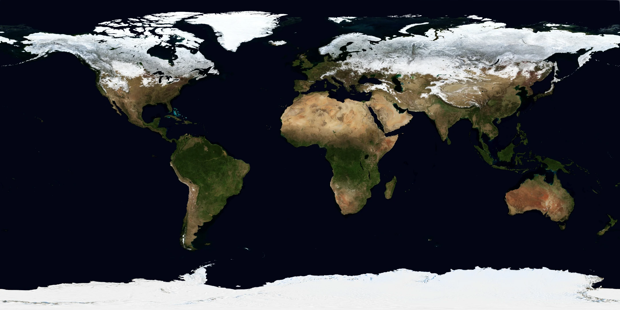
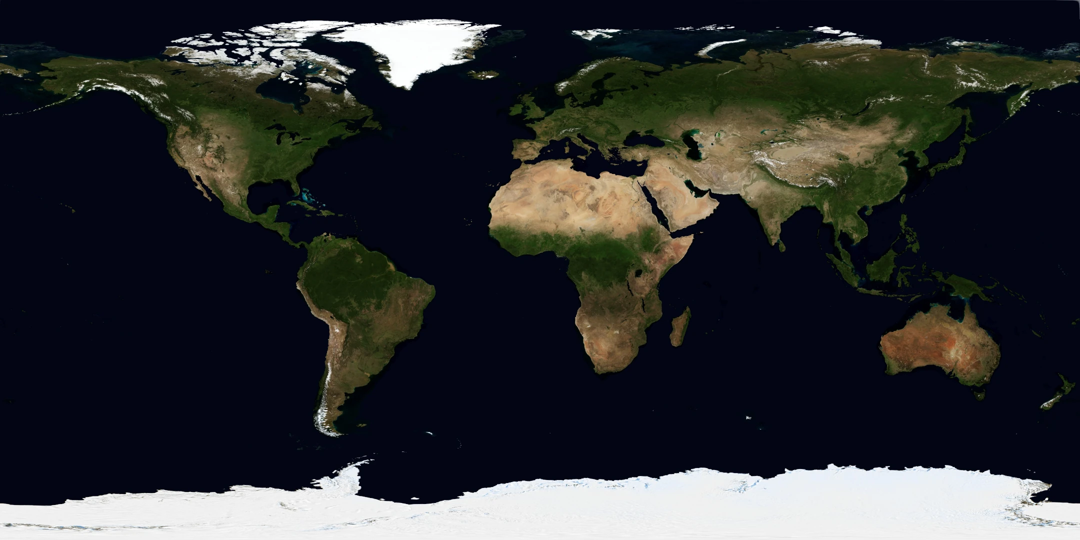
Start with the same place in two months
Open a point in Scandinavia in January, then select July in the timeline. Keeping the location fixed makes the comparison easier: the map changes to the selected month, while the strip shows that cell’s colours across all twelve months.
Try the same exercise near the equator or in a desert. Not every place changes in the same way or by the same amount. You can also compare a latitude band, which combines colours from many locations along a parallel.
What is the timeline showing?
Each swatch comes from the matching month’s prepared image lookup. It is not an animated blend between January and December. The atlas includes only the twelve supplied months from 2004, with explicit month labels.
The annual option combines those monthly images using their numbers of days. Because 2004 was a leap year, February contributes 29 days. This annual display-image mean is a separate view, not a thirteenth observed month.
Colour change is not a climate trend
These images let you inspect differences within one year. They do not show how a place has changed since 2004. A colour difference alone cannot establish a change in temperature, vegetation health or land use, and this atlas does not identify the cause of individual changes.
For an explanation of NASA’s source imagery, see Blue Marble Next Generation. Our method guide explains how that imagery becomes map samples and averages.
Save a comparison
Pin your location, choose a month and copy the share link. The link retains the selected period and coordinates. You can export the timeline as CSV, or download the current view’s colour information as JSON with its provenance.
Explore the monthly maps ↗